I’ve been thinking of explaining the cause of some more illnesses and/or conditions, as I have already done with porphyria and leprosy. Where applicable, I might also use some real-life historical examples of sufferers, such as with George III and Baldwin IV of Jerusalem for the two cases mentioned above.
I don’t know exactly what this would include, but I might, for example, a post about heterochromia or arthritis. Alternatively, I might expand the idea to include phenomena such as the cause of tabby/calico patterns in cats.
However, I thought it would be interesting to see what you think. If I were to make this into a series of posts, which condition should I cover next? Let me know what you think in the comments!
I thought I’d take a moment to discuss how exactly biologists create phylogenetic trees. Our discussion will not include factors such as morphological comparisons etc.- which was more widely used before genetics came along- but rather the molecular methods used today. I thought this would be better served as a blog post rather than a podcast episode, as in blog format I can use images to illustrate what I’m saying (which is predictably rather difficult in audio format!).
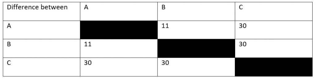
So, let’s say that you’re an ecologist who’s just discovered an uninhabited island far out to sea. There’s three species of snake on this island (hence the picture at the top) and you want to know how long ago these species diverged from their common ancestor. You find a fossil which tells you that species A and species C must have diverged 15 million years ago, but you can’t find anything for the other species. So, instead, you sequence a protein common to all species (let’s say haemoglobin for the sake of argument) which gives you the results in Table 1. How does this help you?
Table 1: The number of amino acids in the protein we’re sequencing that are different between each of the three snake species.
Looking at our table, you can see that, in 15 million years, there have been thirty amino acid sequence changes between species A and species C. However, this doesn’t quite give us our rate of mutation yet. To know why this is the case, you’ve got to consider that both species have been evolving away from their common origin. This means that we’ve effectively got to double the time between them to 30 million years. After all, species A has been evolving for 15 million years and species C has been.
This means that, if we assume a constant mutation rate, we end up with a rate of 1 mutation per million years. What we’ve done is calibrate our molecular clock- we now know the rate of mutation for the protein we’re using to build our tree.
So, let’s now look at the difference between species B and species C, which is also 30 mutations. This means that these two species also had a total evolution time of thirty million years. Dividing by two, we get a divergence time of 15 million years, as with species A. By contrast, species A and species B have eleven amino acid differences, meaning that they must have diverged 5.5 million years ago.
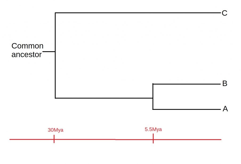
How does all of this fit together? Well, A and B must have diverged after both the A-C divergence or the B-C divergence. This means that C must have split off from the common ancestor first, and then A and B diverged, as shown below:
Figure 1: The phylogenetic tree you end up with as a result of our reconstruction. Time is shown (not to scale) along the bottom)
Of course, there are some assumptions we’ve made while constructing our tree, such as a constant rate of mutation. Added to this, most phylogenies will be a lot more complicated than just three species. However, it serves well as an example of the process by which such tree are constructed. A more in-depth discussion of these assumptions, as well as the process of speciation itself, is a story for another time.
I thought I’d do something different today and discuss one of the contenders for the oldest organism on our planet. So, let me spin you a yarn of a mollusc called Ming, cited as the oldest individual animal for which its age can be accurately determined.
Our story begins back in 2006 when researchers fished up the animal- known as an ocean quahog- from the seas around Iceland‘s northern coast. It was one of two hundred ocean quahogs fished up by the researchers from Bangor University in Wales, as part of a project to investigate the impact climate change has had over the last thousand years.
Once these clams had been taken up from the seabed, the next step was to determine their age. Like with tree rings, there are rings on a clam’s shell which you can count to determine its age, as a new ring is added by the clam each successive summer. These bands can be found on the hinge region of the shell.
So, with that’s said, let us return to Ming. I should mention at this point that ‘Ming’ actually one of two nicknames the clam acquired- the other being Háfrun, an Icelandic female name meaning ‘mystery of the sea’, which it was subsequently given by Icelandic researchers taking part in the expedition.
A first count came in 2007, placing the quahog at 405 years old- which would have given it a birth year of 1601 CE. However, this was pushed back as a result of a re-estimate in 2013, which put it at 507 years old and meant that it would have been born in 1499– comfortably within the period of the Ming dynasty in China, for which it was named during the wave of excitement and interest about its advanced age.
This second estimate was done by carbon-dating, rather than the previous method of using the number of rings on its shell, and was considered by some to be accurate to around one to two years. So, although we can’t be 100% sure when the quahog was born, the 1499 date seems to be generally accepted.
Now we get to the controversial bit. Sometime after being dredged up, Ming died. However, the tricky part comes in pinning down when and why exactly this happened. Some maintain that the researchers were the cause of death in 2007 as a result of opening its shell to make the original estimate of its age. However, this has been contested. Instead, an article on the story by the National Geographic in 2013 maintained the view that Ming was already dead by the time it came back to the lab. If this is true, Ming was killed along with its 199 colleagues as a result of researchers freezing the organisms for storage on the journey back to shore. Whatever really happened, Ming was dead.
Although Ming (c.1499- 2007) will not be increasing in age for obvious reasons, it has still been valuable to research. For instance, accessing its growth rings allows scientists to determine what the temperature of the ocean was every year for the past five hundred years- invaluable data when considering the impact of anthropogenic climate change. In addition, it might contribute to ageing research– after all, if we can find out what caused Ming to live to such an advanced age, perhaps it can be applied to humans.
So, that’s Ming the Mollusc, also known as Háfrun. To finish, I thought I’d give you some perspective on its great age. When Ming was born in 1499, Leonardo da Vinci was still beavering away on the Mona Lisa and the voyage of Columbus had only happened seven years earlier. Even if we don’t end up learning anything that will be applicable to humans, it certainly shows how varied the natural world can be.
I just wanted to share something that I’ve recently been delving into a bit more thanks to my studies- namely, the age of the Earth people commonly accepted before the theory of evolution as proposed by Darwin and Wallace in 1859 came along. I thought it might give some idea of how big a shift in perspective would have been needed for the average person back in 1859.
So, how old was the Earth commonly accepted to be? Well, it was mostly calculated using the generations and ages listed in the Bible. There’s a YouTube video published in 2020 which uses the chronology to calculate that, if people used the text literally, the world would have been thought to have been created in 4163 BCE.
The chronology that I think is most often cited is that of James Ussher, an Irish bishop. His date is 4004 BCE, which indicates that a sort of consensus appears to be forming between these old thinkers that the Earth was perceived to be roughly six thousand years old.
Consider, then, the contrast between this number and the age of the Earth which we’ve calculated today- about 4.54 billion years. Let’s suppose we make the number calculated by Ussher (5863 years old in 1859) equivalent to one step (which I’m going to approximate as a metre for the sake of my calculations). To walk this new age of the Earth, you would have to travel over 774 kilometres- very roughly 484 miles. For context, Google maps tells me that’s a longer journey than driving from Portsmouth to Edinburgh.
None of this is to say that the theory proposed isn’t correct- there’s a wealth of biological evidence to back it up. However, I find myself agreeing with the sentiment I saw expressed by Stephen Jay Gould– just because their ages of the Earth turned out to be wrong, doesn’t mean that we should deride the people behind it for that.
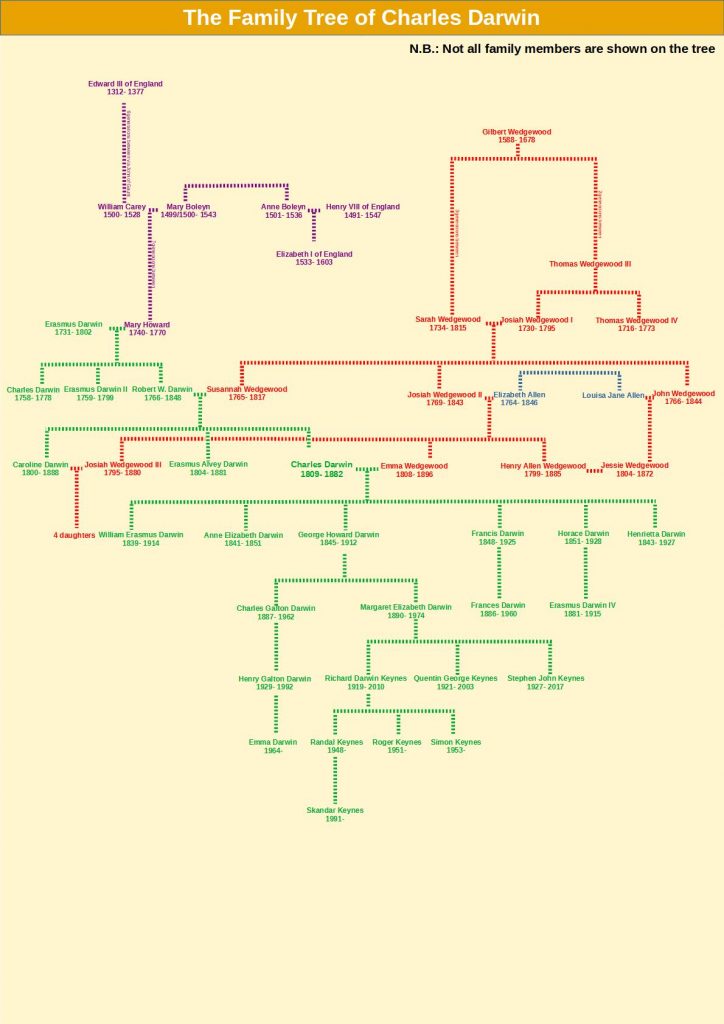
To commemorate the anniversary of Darwin’s birth (12th February), I’ve created a Darwin’s Day episode which discusses the illness of Darwin and his immediate family and what could have caused this. There’s a 2017 paper, used as source material for the episode, which discusses this question. However, some of the relationships discussed (and indeed those not discussed) are hard to visualise. So, I’ve created a family tree of Charles Darwin to accompany the episode!
A family tree of Charles Darwin! The information here is collated from various Wikipedia articles for the people on the tree, as well as a website called Famous Kin.
Due to the nature of this kind of information, most of my information for this tree is sourced from the Wikipedia pages of these individuals. However, there’s also a website called ‘Famous Kin‘ I found, which I used to discover the descent from Edward III shown on the tree.
I’ve also shown some (but not all) the descendants of Charles Darwin on this tree, such as the actor Skandar Keynes– who played Edmund Pevensie in ‘the Lion, the Witch and the Wardrobe’, the novelist Emma Darwin, and Erasmus Darwin IV, a soldier who was killed during the larger Battle of Ypres in 1915.
In Part 1 of this topic, we discussed a 2016 paper highlighting that non-bee pollinators have a significant role to play in pollination, as opposed to the conventional view that bees pollinate flowers and that’s largely it. However, as I’m going to discuss this time, there are some in the scientific community who think that labelling a ‘bee decline’ is premature. One example of this would be Jaboury Ghazoul- then a professor of Ecosystem Management at ETH Zurich- who published a review paper on the subject in ‘Trends in Ecology and Evolution’ back in 2005. There’s a link to the abstract of the paper here.
Ghazoul noted that many of the world’s staple crops, such as cereals or potatoes, do not rely on animal pollination at all, instead being wind pollinated or not requiring pollination in the first place. Instead, most of the crops that needed to be pollinated were high value-per-unit commodities, which would shift the apparent economic importance of bee declines and distort our picture.
Second of all, he argued that reports of a pollination crisis were mainly driven by reports of honeybees declining in North America, or the decline of bumblebees/butterflies in Europe. By contrast, he argued that the response of native pollinators to climate change has been mixed rather than a universal decline as is often portrayed.
This does not mean, Ghazoul’s reasoning goes, that there isn’t a real threat. However, his argument was that labelling a pollination crisis was premature and that research efforts should instead focus on preventing such a decline rather than panicking about one.
Now, I am not a professional pollination ecologist, so it’s very difficult for me to say what the exact nature and extent of the pollination crisis is. However, in a media which is usually dominated by the narrative of bee declines, it’s interesting to note that there are voices of dissention within the scientific community. The question, it seems, has not been settled yet in the minds of some.
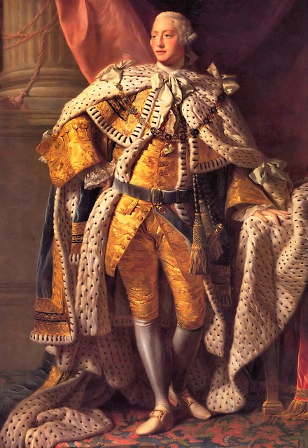
As we’ve already discussed the genetics of one disease back in episode 14, I’d like to focus on another in the form of porphyria- most famously suffered from by George III. However, this is not an isolated case within his family. In fact, porphyria can be seen throughout the family across the centuries, as I discovered when reading two papers from 1968 and 1982 which focus on the ancestors and immediate family of the king. So what causes porphyria and how is it passed down?
Porphyria is actually a group of diseases, one of the main symptoms of which is an increased secretion of proteins called porphyrins into the urine of patients. Porphyrins can also build up in the liver, which may lead to impeded liver function and an elevated risk of liver cancer. Alternatively, the nervous system can be impacted, which may lead to attacks and hallucination.
In porphyria patients, there is a mutation for the enzyme which produces haem according to the British Liver Trust. For reasons I’ll discuss in a moment, I think that this may actually be referring to haemoglobin– a molecule inside your red blood cells which binds them and allows them to carry oxygen through the blood. Haemoglobin is one of the derivatives of porphyrins, which I believe may be why porphyrins then build up- after all, if haemoglobin can’t be produced correctly, it seems logical that the products from the previous step should build up. For this reason, I believe that the ‘haem’ in the British Liver Trust article may refer to haemoglobin, as stated in the Encyclopaedia Britannica.
Most types of porphyria are inherited in an autosomal dominant fashion, meaning that only one copy of this allele needs to be inherited for symptoms to manifest- which might explain how it symptoms kept cropping up in the family shown below. However, there are rarer versions which are recessive, meaning that both copies of the gene need to be faulty before symptoms manifest.
So, that’s porphyria. As an interesting aside, there’s a 2011 article in the New Scientist which mentions that one sufferer is likely to have been Vlad Dracula, which may have started the idea that vampires can’t abide sunlight. In cutaneous porphyria, areas of the skin exposed to sunlight can become blistered. Afflicted individuals consequently avoid sunlight due to pain. Moreover, their skin may shrink back around the mouth, leading to the impression of fangs. I’m not going to go into it article here, but it’s certainly interesting to think that a disease suffered from by kings through the ages may have led to modern ideas about vampires.
Bee declines are prevalent in the modern news and it is an issue which many people feel strongly about. The worry is that pollination services and thus the economy will suffer if bees are not able to carry out their job- as was highlighted to me as a child in the Bee Movie. However, how real is the threat? In this first part of a series, I’m going to discuss a 2016 paper by Rader et al., which argues that we might be overlooking something crucial- namely, non-bee pollinators.
This review paper synthesised 39 individual studies across five continents. Rader et al. found that, on the whole, non-bee pollinators make a pretty sizeable contribution; non-bees provided about 38% of visits to all crops. In addition, non-bees seemed to be more robust when it came to landscape change. The number of bee visits declined sharply, while this decrease was not as marked for non-bees.
Although non-bee species were found to deposit less pollen per visit and were thereby less efficient, they compensated for this by having a high proportion of visits than bees did, meaning that on the whole this limitation was cancelled out.
However, the study does have its limitations. For example, it specifically focuses on non-bee insects and does not consider other pollinators such as hummingbirds or bats at all.
So, what do these findings mean? The authors emphasise that the reliance of the modern world on one or a few pollinators is an inherently fragile situation. This makes logical sense; if you hypothetically rely on one species, your prospects don’t look great if that species becomes threatened in any way. This warning is likely to become increasingly relevant as the threat of climate change advances.
When discussing genetics, people often bandy about the phrase ‘inbreeding coefficient’- essentially a mathematical way of expressing how much inbreeding there is in someone’s ancestry. As an example, Charles II of Spain had an inbreeding coefficient of 0.254, which is higher than the 0.25 which results from the children of a sibling or parent-child union. I haven’t been able to find a public-domain image of Charles II’s ancestry, but have a look at his Wikipedia page if you’re interested in the detail. Sufficed to say, Charles II was not a healthy man, dying at the age of just 39. He had been unable to walk until the age of 8 to 10 and in Spain was known as ‘the Bewitched‘.
There are people who have calculated figures like this for other people. For example, there is a blog post which informed me that Danaerys Targaryen, one of the (many!) point-of-view characters of Game of Thrones would have a coefficient of 0.375. But how is this figure calculated?
Although I haven’t been able to figure out exactly how it works for more complicated puzzles such as the ones we’re discussing, I’m going to take you through the process for some simpler examples, using a method I learned from a blog I’m putting a link to here. Please note that this is a guide to the method, rather than a discussion of the impacts of inbreeding on particular families. However, if this is something people would be interested in, I have found some papers which reconstruct the diseases suffered from by the Ptolemies of Egypt using their symptoms, so if this is something people would be interested in, feel free to let me know in the comments.
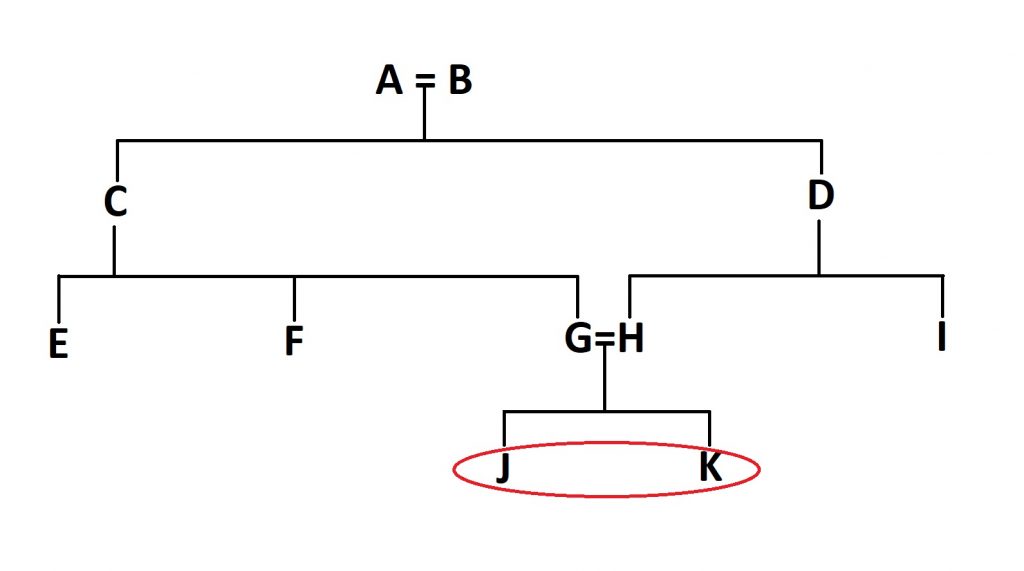
So, let’s try and work out the inbreeding coefficient of these two individuals:
Figure 1: The high-tech example tree we’re going to be using. Individuals J and K (circled here in red) are the people we’re going to be calculating an inbreeding coefficient for.
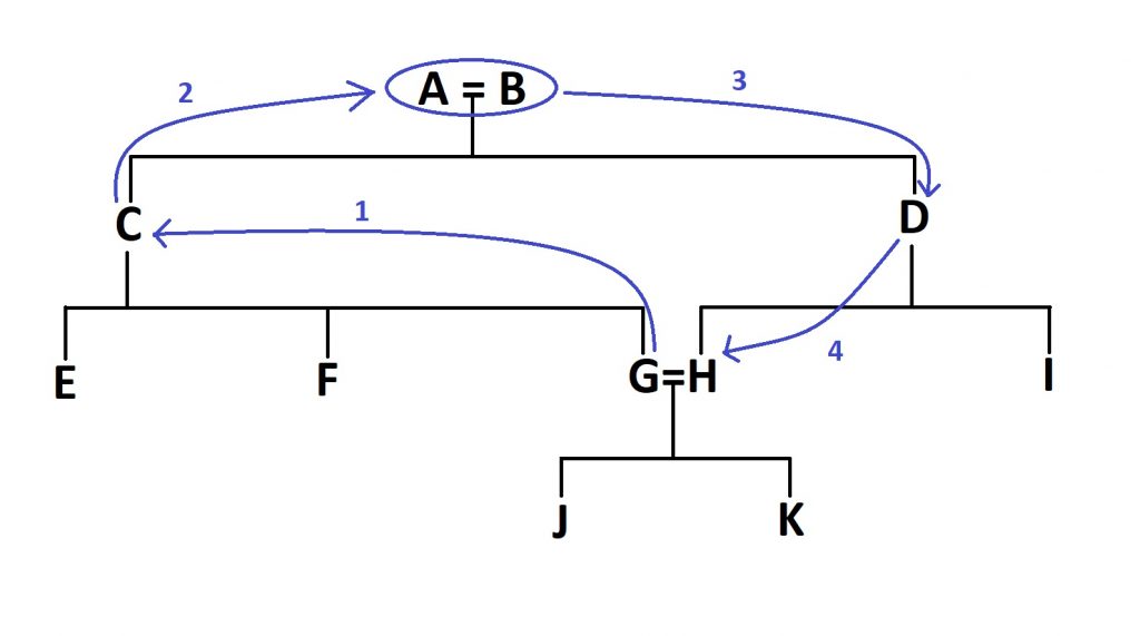
The first thing we need to do is to find the first inbred individuals in the family tree- in this case, J and K, as their parents (G and H) share a set of grandparents and therefore common ancestors. Once we’ve found them, we need to count the number of steps between the two parents:
Figure 2: After identifying the first inbred generation in the tree (J and K in this case), you need to identify the number of ‘steps’ between their parents- the number of steps needed to close the loop, as it were.
In this case, we would need four steps, through the grandparents (A and B) to get from G to H, as shown in Figure 2.
Now the first bit of the equation. Take the number of steps and add one. You might now be breathing a sight of relief, but we’re sadly not done after this point. Now you need to raise 0.5 to the power of this new number. So for our example above, it is (0.5)^5, or 1/32, or 0.03125. This new number needs to be doubled, as this exact same route can be taken through both parents (this wouldn’t be the case if they were related through half-siblings, for example). So, the number you end up with is 0.0625, or 6.25%. So, the coefficient of inbreeding for two individuals born from a first-cousin union is 6.25%, or 1/16th.
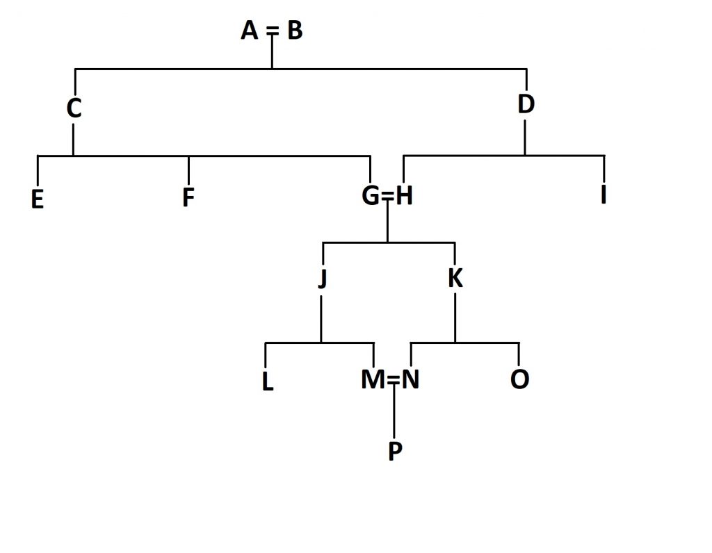
But we can go further. What if the children of J and K (let’s call them M and N) marry and have children? How will this impact the inbreeding coefficient of individual P?
Figure 3: The extension of our family tree to include a second set of first cousins marrying.
First off, go through the same process again for these new parents, M and N. You end up with 1/32 for this loop, as you did last time. Double it as before and end up with 1/16th.
But now, we need to go through some more steps. We need to add one to this 1/16th we got last time to get 17/16. This might not seem logical at the moment, but bear with me.
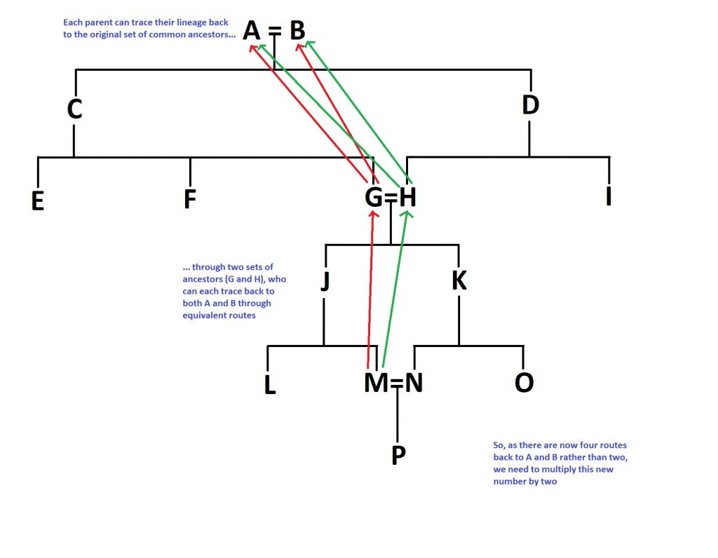
The reason we’re doing this is that this second set of parents don’t start off with a clean slate, if you like- they are inbred themselves, given the marriage of individuals G and H way back in the day. So, the equation for this second set of inbred parents is accordingly more complicated. You need to multiply the number you would otherwise get (1/16th for our purposes) by the 17/16 you just got and then multiply all of that by 2. Why double it? Well, because the number of routes you can take to the original common ancestors A and B has doubled; both M and N can trace their lineage back to them via both G and H. To summarise that logical jump, here’s a diagram:
Figure 4: A summary of the complex equation we discussed above. This multiplication is proportional to the proportion of extra routes we can take. For example, if A and B had been first cousins, you would end up with twice as many routes again, so this bracket would have to be multiplied by four rather than two.
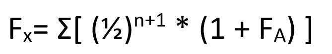
Now the final step, I promise. We now need to add these two numbers together- the original number we got for G and H, and the second number we’ve just calculated for P. So, adding this all together, you get:
1/16 + (1/16 * 17/16 * 2) = 0.1953125, which rounds to 0.195, or 19.5%.
This whole process can be summarised as:
Where (1 + F(A)) refers to the inbreeding coefficient adjusted for the already inbred parents- in our case, the 17/16 we calculated earlier.
Here’s hoping that I’ve managed to explain all of this correctly, as truth be told it took me quite a while to get my head around it. If not, feel free to let me know and I’ll be sure to update this post when I am able to.
(This material connects to what I discussed in episode 1- Biofilms)
Biofilms- aggregates of material in which bacteria are encased and grow– are relevant structures to fields such as medicine and dentistry, as I mentioned in episode 1. However, when I discussed them back in October 2020, I specifically mentioned their relevance to disease. So, today I thought I’d elaborate a bit and discuss a specific example that is at the forefront of modern research. Specifically, we’re going to talk about Alzheimer’s.
This connection between biofilms and Alzheimer’s is made in a 2020 review paper published in the Clinical Microbiology Newsletter. Although there are other ways of phrasing it, I thought it would be easiest to describe the theory in sequence, starting with infection and ending with the symptoms of Alzheimer’s itself.
So, what happens after biofilm-capable bacteria invade the bloodstream? Bacteria in the mouth have the capacity to form biofilms- to the great frustration of dentists everywhere. It is possible that biofilm fragments of around 100 to 1000 cells, complete with extracellular matrix, can become dislodged, enter the bloodstream and become coated with immune system components. Ordinarily, liver cells called ‘Kupffer cells’- which are capable of phagocytosis- are able to deal with these ‘proto-biofilms’ once they reach the liver. However, if a fragment has all the protective abilities of a biofilm, these Kupffer cells might not be able to digest them. In this case, the fragments can end up in the arterial system. As the aorta pumps oxygenated blood from the heart to the rest of the body, you can imagine that this is a problem.
And this is where genetics and other host factors come into the equation. Ideally speaking, the blood-brain barrier (BBB) should not be permeable enough for these fragments to enter into the brain. However, if the immune system of the host is impaired for whatever reason, such as in the case of diabetes or as a result of normal aging, these biofilm fragments might be able to enter the brain.
This becomes a problem if the biofilm is able to establish itself on the tissues of the brain. In order to obtain nutrients and prevent the host healing, the biofilm provokes constant inflammation, as evidenced by two to three orders of magnitude more interleukins and far more neutrophil immune cells than you would expect. In essence, the biofilm hijacks the immune system to create this inflammation.
There are different host reactions to this chronic inflammation, but the most relevant for our purposes is the formation of amyloid- the formation of large aggregates of amyloid protein in the extracellular space. These amyloid plaques are then supposed to be responsible for the so-called ‘tauopathies’ which are classically associated with the pathology of Alzheimer’s.
Now, it’s important to realise that there is no consensus about what causes Alzheimer’s. For all we know, the biofilm-involved mechanism might not be the ultimate cause. As I highlighted with the possibility that amyloid plaques causing tauopathies, all of these factors may even connected. There are two other factors that have been suggested which I am going to cover in separate posts- a microtubule-binding protein known as tau we mentioned just now (discussed in Part 2) and the possible role of microbiome dysbiosis (in Part 3).